

Product Design / Consumer / Growth
From fragmented searches to a discovery product for making the most of your birthday
I designed and evolved a platform that organizes brand and merchant benefits, connecting discovery, structured content, trust, and organic growth.
If it's your birthday today, you don't bring the gift
Explore every birthday benefit in Buenos Aires.
A behavior that already existed
Every year the same pattern repeats: people searching for lists, videos, and posts about places offering something free or discounted for birthdays. It wasn't a new behavior. It was a fragmented one.
The opportunity didn't come from inventing a need. It came from structuring a behavior that already happened on social media, individual searches, and recommendations between friends.
Cumpleañito started focused on Buenos Aires, where brand concentration and search density made a first catalog with 150+ collected benefits viable.
Collecting benefits wasn't enough
A static list doesn't answer the questions that really matter when someone decides whether it's worth visiting a store or signing up for an app:
- Is it still valid?
- Where does it apply?
- Do I need to register first?
- Is it only on the birthday or the whole month?
- Does it work at every branch?
- How do I redeem it?
- Did it work for other people?
The value wasn't just in gathering benefits, but in structuring enough context for someone to decide whether they could actually use them.
Multiple paths to the same benefit
Not everyone arrives the same way. Some know which category interests them; others search near their neighborhood; others want to filter by conditions before committing. The product needed to support all those intents without duplicating content.
| Dimension | Example | Route / mechanism |
|---|---|---|
| Category | Food & Drink, Fashion, Beauty… | /beneficios/categoria/[slug] |
| Location | Palermo, Recoleta, Belgrano… | /beneficios/[barrio] |
| Search | Header query → /beneficios?q= | /beneficios |
| Type | Gift vs. discount | Listing filter |
| Conditions | Verified, no minimum purchase | Sidebar filters |
| Sort | Relevance, top rated, recent | Sort parameter |
| Map | Spatial exploration | /mapa |
| Favorites | Personal list | /favoritos |
Structuring was a product decision
Each benefit needed to become an entity with defined fields. It wasn't just a technical decision: it determined what could be searched, filtered, compared, indexed, and scaled.
The model includes brand, benefit type, category, location, multiple branches, redemption instructions, conditions, validity, and community validation signals.
I prioritized fields that answered real decision questions, not decorative metadata. If a field didn't help filter, compare, or build trust, it didn't enter the model.
Each field enables search, filtering, comparison, or trust signals
| Field | Product purpose |
|---|---|
| Brand | Identification and trust |
| Title | One-line value proposition |
| Short description | Quick evaluation in listings |
| Long description | Context on detail page |
| Type | Gift, discount, 2-for-1, or other |
| Category | Discovery by interest |
| Location | Geographic relevance |
| Branches | Multiple redemption points |
| Redemption | In-store, online, code, or link |
| Instructions | Reduce uncertainty |
| Applicable days | Usage window |
| Minimum purchase | Economic condition |
| Companions | Social requirement |
| Warning | Exceptions and nuances |
| Verified | Editorial trust signal |
| Votes | Community validation |
What does someone need to know before opening a benefit?
The card had to allow relevance evaluation without opening the detail page, even when available information varied between brands. Name, value proposition, category, location, benefit type, and trust signals appear in a clear visual hierarchy.
Sidebar filters reduce noise by neighborhood, category, type (gift vs. discount), verified status, and no minimum purchase, with sorting by relevance, rating, or date.
Free drink during the month
Free drink of your choice during your birthday month for registered users.
Replica based on BenefitCard, using Starbucks data from the live catalog
From "looks interesting" to "I know how to use it"
The detail page shouldn't sell the benefit. It should reduce uncertainty. To do that, it concentrates long description, requirements, applicable days, minimum purchase, companions, warnings, redemption instructions, and locations with a map.
The redemption flow requires declaring intent ("I want to use this benefit") before revealing full instructions. This measures real interest and prepares the user for the moment of use.
Share, save to favorites, and vote live in the same layer. Each one answers a different need: spread, postpone, or validate.
Don't pretend absolute certainty
Benefits change, expire, vary by branch, and depend on conditions that brands don't always document well. The product shouldn't present everything as 100% verified.
Trust is built with editorial signals (verified badge), validity dates, community votes, user reports, and explicit warnings when information is incomplete.
In a product based on changing information, trust depends as much on what we show as on how we communicate uncertainty.
Did this benefit work for you?
A binary answer addresses the main question: is it still valid?
A centralized database doesn't scale alone
I implemented a binary voting system: "Did it work for you?" with Yes / No options. One vote per user per benefit. It's not a review system. It answers the main uncertainty: whether the benefit is still valid in practice.
Complemented with reports that notify the admin by email when someone detects incorrect information or a benefit that no longer works.
A binary answer can be more useful than a full review system when the main uncertainty is whether the benefit still works, not what the dining experience was like.
Discovery and use don't happen in the same session
Most people don't discover a benefit on the exact day they'll use it. They might find it weeks earlier, during planning, or through a friend's recommendation.
Favorites let users build future intent: save, return as the birthday approaches, and keep a personal collection at /favoritos.

Live product asset: favorites empty state
People were already searching for these answers
The challenge was aligning product architecture with existing search behaviors, not bolting SEO on afterward. Categories, neighborhoods, individual benefits, and blog generate indexable pages with metadata, Open Graph, and JSON-LD Offer schema.
Routes confirmed in sitemap.ts and App Router structure. /buscar permanently redirects to /beneficios; /ubicaciones redirects to /mapa.
Organic growth as a product consequence
The product can grow through organic traffic (SEO), sharing benefits on social media, user contributions, sign-up for interactions, and return visits via favorites. I didn't design aggressive pop-ups or content gates. Growth comes from real utility.
Product hypothesis
Growing without degrading quality
At /sumar-beneficio, anyone can recommend a benefit without an account. The form asks for business name, title, description, and redemption instructions: the minimum to evaluate the proposal.
Contributions enter as draft with is_user_submission. The admin completes category, image, location, and other required fields before publishing from the "Pending" tab.
Allowing contributions expands coverage, but introduces a new problem: how to grow without degrading information quality.
Setting context from sign-up
After creating an account, onboarding collects name, birth date, interests (gifts, discounts, promos with friends), and plan types (eating out, shopping, outings). It also offers a birthday reminder.
Today these preferences prepare future personalization: there's no recommendation algorithm implemented yet. The decision was to capture intent without promising personalization that doesn't exist yet.
A brand doesn't always equal one location
Many benefits apply at multiple branches with different addresses. The benefit_locations model links a benefit to several branches with coordinates and a specific address.
On /mapa, Google Maps shows filterable markers. On the detail page, the map and address list answer: "which one do I go to?"
I separated location_id (main neighborhood for SEO and filters) from benefit_locations (specific branches for redemption) to avoid forcing a single location when reality is more complex.
Consistency as the catalog grows
As the catalog grew, consistency stopped being aesthetic and became functional. Same cards on home, listings, categories, and neighborhoods. Same category chips. Same empty states. Same favorite, vote, and share patterns.
Product design tokens (primary #a77dea, secondary #fee177, Nunito typography) carry through the entire flow, from the card to the authentication modal.
I didn't build a separate documented design system. I built patterns that repeat because the product needs them at every touchpoint.
Benefit with ambiguous day window
- What could happen
- Some brands apply the benefit only on the birthday; others, the whole month.
- Risk
- Wrong expectations and frustration at the store.
- Decision
- The days_applicable field appears on the detail page and, when available, on the card as a validity date.
Multiple branches with different conditions
- What could happen
- A brand may be present in several neighborhoods, but not every branch participates.
- Risk
- The person goes to the wrong location.
- Decision
- Many-to-many benefit_locations with an interactive map and address list on the detail page.
App or prior registration requirement
- What could happen
- Starbucks Rewards, loyalty apps, memberships.
- Risk
- Arriving unprepared and missing the benefit.
- Decision
- redemption_instructions and warning_text visible only after declaring intent to use, to avoid cluttering the card.
Incomplete information on submission
- What could happen
- User contributions arrive without category, image, or location.
- Risk
- Low-quality content in the directory.
- Decision
- Submissions enter as draft; the admin completes required fields before publishing.
Possibly expired benefit
- What could happen
- Promotions change without notice on brand websites.
- Risk
- Loss of trust in the platform.
- Decision
- Binary votes, user reports, and editorial verified badge, without pretending absolute certainty.
More benefits vs. better quality
Increasing coverage improves discovery and SEO, but raises the risk of outdated or incomplete information.
Decision: Publication flow with admin moderation and community signals to prioritize what's current.
Less friction vs. more context
A simple card makes exploration easier, but can hide conditions that matter for deciding.
Decision: Two-layer hierarchy: quick evaluation in listings, uncertainty reduction on the detail page.
Open growth vs. moderation
Allowing contributions scales content, but introduces noise and duplicates.
Decision: Public form at /sumar-beneficio → draft state → review in admin panel.
SEO vs. navigation
Indexable pages by category and neighborhood capture long-tail searches, but must still be useful for real users.
Decision: Landings use the same listing component and filters as the main directory, not empty SEO pages.
Sign-up vs. access
Requiring an account enables favorites, votes, and personalization, but adds friction to discovery.
Decision: Open navigation and listings; interactions (favorite, vote, redemption) require authentication.
As new needs emerged, the product added layers. There's no confirmed timeline with dates. This is the logical evolution sequence observed in the code and current structure.
Migration from WordPress to Next.js with structured benefits, categories, and detail pages with SEO metadata.
Filters by location, type, verified status, and minimum purchase. Category and neighborhood landings. Map with Google Maps.
Binary votes, redemption intent, reports, verified badge, and social sharing.
Sign-up (Google + email), onboarding with preferences, favorites, benefit submissions, and admin panel.
ISR, server-side prefetch, edge request optimization, dynamic sitemap, and JSON-LD Offer schema.
Traction signals
An existing behavior can become a product
The opportunity wasn't inventing the need to make the most of a birthday, but structuring a behavior that already happened on social media, searches, and recommendations.
More content doesn't equal more value
Utility depends on context, quality, and the ability to decide. Adding benefits without structure only reproduces the original problem in another format.
Trust needs design
When information changes, the experience must show clear signals, allow feedback, and communicate uncertainty without weakening the proposition.
SEO can reveal the mental model
Searches by category, neighborhood, and brand showed how people frame their needs, and that informed the information architecture.
Consumer Product Design is also architecture
An apparently simple experience (search, filter, save) depends on taxonomies, states, moderation rules, and validation loops.
The product evolved from observed behavior, user feedback, usage data, and new needs detected during growth, not from a formal documented research process.
Más proyectos

B2B • Marketplaces • SaaS / management tools
Designing the flow that turns campaigns and applications into collaborations
Campaign live, applications in, creator still to pick. I bridged brand and creator without losing context until collaboration starts.
Fintech
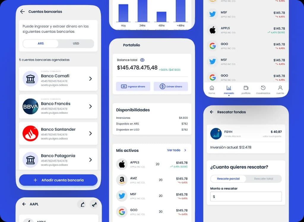
Designing clarity for portfolio, positions, movements, and financial operations
White-label trading and portfolio platform for stockbrokers. Dense screens where clarity and operations had to coexist.