

Product Design · UX Strategy · Discovery
Organized information to decide to go, or to confirm you're going when you already had a place in mind.
I designed Telofinder for two moments: someone still choosing between motels, and someone who already knows where they want to go but needs photos, hours, reviews, and directions to close without doubts.
- Product
- Telofinder
- Role
- Founder & Product Designer
- Timeline
- Launch · Mar 2025 · Redesign · Mar 2026
- Platforms
- Responsive web · Mobile-first

Directory of short-stay motels in Argentina. Information to choose or confirm you're going. Launched in March 2025; full redesign in March 2026.
telofinder.com ↗Context
It's not just comparing: it's deciding to go or confirming you're going.
The options exist on Google, Maps, or each motel's website. What's missing is organized information for two distinct moments: choosing between options or reaffirming a choice you already had but still doubted.
Finding options isn't impossible. What's hard is having everything you need to close: photos to picture the place, hours to know if you can go now, reviews to trust, an address to get there, and price to orient yourself, without opening five different sites.
I identified two journeys. Someone who hasn't decided yet needs to compare and choose. Someone who already intended to go, because it was recommended, because they passed by, because they already know it, arrives with doubts: is it still open?, what does it look like inside?, is it worth it?, how do I get there?
Use is often urgent: the person already knows they'll have sex and needs a private, nearby space. But the product has to serve both cases, convince them to go or confirm they're going, with the same clear information.
I wasn't designing «a motel website». I was designing the moment someone stops doubting and says: okay, I'm going.
Choose where to go
Still undecided. Needs to see options, compare price, location, and services to decide «I'm going to this one».
Confirm they're going
Already had intent, a name, a neighborhood, a recommendation, but lacked information to feel sure: what it's like inside, whether it's open, what reviews say, how to get there.
Information that closes the decision
- · Photos that show what the place is like
- · Clear hours, can I go now?
- · Reviews and rating to trust
- · Address and directions
- · Price to orient yourself or compare with other options
- · Direct contact once you've decided
telofinder.com/albergues
Habana
Flores, CABA · ★ 4.1
The challenge
Solving an urgent decision without building a maze.
The product has to help people choose or confirm in minutes, often under urgency, without losing clarity as content and scope grow.
From the user
- Decide where to go when still in doubt
- Confirm they're going when they already intended to but lacked info
- See photos, hours, and reviews without jumping between sites
- Compare nearby options if needed
- Contact without friction once they've decided
Tension
More options and more filters give control, but they can also paralyze someone who only wants to see «what's nearby and how much it costs».
How people discover
Not everyone arrives with the same question.
I mapped different intents, choose, reaffirm, urgency, area, service, price, and turned them into clear paths inside the product.
Choose
Someone comparing neighborhood options to decide which one to visit.
Reaffirm
Someone landing on a specific profile, from Google or a link, who needs photos, hours, and reviews to confirm they're going.
Urgency
Immediate moment: private space nearby, visible price, and direct contact, whether to choose or to confirm.
By location
Neighborhood pages for someone exploring the area or arriving from Google searching «motels in Flores».
By need
Paths like «with jacuzzi» or «near me» for someone prioritizing an attribute over a specific neighborhood.
A system, not a list
Information had to be structured so the product could scale.
Each motel is a profile, but the value is in how it connects to neighborhoods, prices, hours, and trust signals.
I defined a common model: the same structure to choose in the listing, go deeper on the profile when it's time to close, explore on the map, or arrive from a neighborhood search. Listing and profile respond to different moments of the same decision journey.
- ✓Directory to choose with visible prices and signals
- ✓Profiles to go deeper and close the decision
- ✓Map to explore by proximity
- ✓Neighborhood and need-based pages
- ✓Overnight hub with prices
- ✓Favorites to compare again later
- ✓Google reviews when available
- ✓Telofinder coupons and benefits
- ✓Survey to hear real friction
Designing the decision
Listing to choose. Profile to close.
The listing helps people comparing. The profile goes deeper for someone who already has a candidate, or arrived with intent, and needs photos, hours, map, and reviews to confirm they're going.
telofinder.com/albergues
Habana
Flores, CABA · ★ 4.1
telofinder.com/albergues/...
Slots and overnights
Decisión
Choose in the listing
Price, neighborhood, rating, and key services visible at a glance, for someone still deciding between several options.
Decisión
Close on the profile
Photos, slots, map, and reviews for someone who already intended to go but needed to confirm this was the place.
Decisión
Mobile: decide and act
WhatsApp and «get directions» always accessible. The decision is often immediate; final steps can't hide at the bottom of the scroll.
Decisión
Plan B in the same neighborhood
Alternatives at the end of the profile in case, after seeing the info, they prefer another nearby option without starting over.
Filter without overwhelming
Control without turning the product into a form.
On desktop, filters sit to the side; on mobile, a panel opens without fully blocking the feeling of exploration.
Tension
Frequent searchers want precision; first-time visitors just want to see options.
- · Location (city and neighborhood)
- · Amenities (jacuzzi, parking, Wi-Fi…)
- · Minimum rating
- · Payment methods
- · Overnight hours
- · Coupons and benefits
- · Sort by price, relevance, or proximity
telofinder.com/albergues
Filter
City
Neighborhood
Amenities
Overnight
Sort by
Trust
Not all data is equal, and design shouldn't pretend it is.
Reviews, up-to-date photos, and content curation matter especially when someone already intended to go and only needs to feel safe enough to confirm.
Decisión
Google reviews
Key to reaffirm: when they exist, they show rating and volume. When they don't, the interface doesn't invent stars.
Decisión
Favorites
Save options to decide later, or return to a profile when you almost closed but want to compare one more.
Decisión
Content curation
Process to review and update profiles, because in this market prices and hours change often.
Decisión
Listen to users
Contextual survey to detect real friction and prioritize improvements with evidence, not assumptions.
Coupons and retention
Beyond the first decision: a reason to come back.
The directory helps choose or confirm. Coupons add concrete value, an exclusive benefit through Telofinder, and create a loop that brings people back.
Solving whether you'll go, or confirming you will, covers the first visit. But if Telofinder were only that, there wouldn't be a strong reason to create an account or return next time you need a place. Coupons closed that gap: benefits negotiated with partner motels you only get through the product.
I designed the experience so the benefit lives where you're already deciding, on the motel profile, with a short flow: see the promo, claim the coupon, save it, and show it at reception when you arrive. Without turning Telofinder into a generic coupon app or pulling the user out of the comparison context.
The coupon doesn't replace the decision to go. It reinforces it, and gives you a reason to choose Telofinder next time.
telofinder.com/albergues/habana#beneficios
15% off 2-hour slot
Present your coupon at reception and mention Telofinder.
Code · •••••
- Step 1
Discover
You compare motels and see if any has a Telofinder benefit.
- Step 2
Claim
From the profile, you claim the coupon with your account, in seconds.
- Step 3
Save
It stays in «My coupons», ready for when you go.
- Step 4
Use
At reception you show the code and access the benefit.
- Step 5
Return
New promos and active coupons bring you back to the product.
Decisión
Benefit in context
The promo appears on the motel profile you're evaluating, not in a separate listing that competes with comparison.
Decisión
Account with purpose
Asking for registration when claiming the coupon has clear meaning: save the benefit. If you leave and come back, the coupon stays in «My coupons».
Decisión
Reception mode
When you arrive, you show the code full screen, designed for the moment of use, not to hunt for it in email.
Decisión
Return loop
Home with featured promos, «with coupon» filter in the directory, and new offers with partner motels invite you back before the next visit.
Benefit types
- · Discounts on slots or overnights
- · Complimentary perks (drink, extra minutes)
- · Room upgrades
- · Exclusive experiences with partner motels
Design decisions
- · The benefit appears on the profile, not on a separate site
- · Claiming the coupon asks for a light account, not a long process
- · «My coupons» concentrates what's active so you can return without searching again
- · Reception mode: show the code at the right moment
- · «With coupon» filter for someone prioritizing savings when deciding
Tension
A discount can tip or reaffirm the decision, but it can't be the only thing Telofinder offers, clear information remains the core.
Evolution
From the first version to the redesign: the product grew with its audience.
I launched in March 2025. A year later, with more traffic and more learning about how people use the product, a full redesign arrived in March 2026.
- Mar 2025
Launch
First public version: directory, profiles, and focus on CABA and AMBA.
- 2025 - 2026
Growth
More establishments, more traffic, coupons with partner motels, and learning about how people search, compare, and return.
- Mar 2026
Redesign
Clearer experience, better comparison, refined filters, and location-based landings aligned with how people search.
Decisión
What changed in the redesign
Clearer visual hierarchy, better comparison, refined filters, coupons integrated on the profile, and location landings aligned with how people search.
Decisión
What stayed
The value proposition: clear information to choose or confirm, plus exclusive benefits, with organic growth as the main channel.
Impact
Traction signals, with context.
Each figure corresponds to a different moment. I don't assume all traffic was organic from day one.
~20K
monthly visits
March 2026 · total traffic (not all organic)
~17K
organic visits
June 2026 · reported figure
~4.2K
Coupons claimed
Internal estimate · review
~2.1K
Users with accounts
Registration / favorites · internal estimate
~19%
Contact rate from profile
Internal estimate · review
Reflections
What this project taught me.
The product map matters as much as the screen
Not everyone enters to compare ten options. Some already know where they're going and only need to reaffirm it. I mapped both journeys, choose and confirm, before designing listings, profiles, and filters.
Google search is part of the product
Many users arrive searching for a neighborhood or a specific need. I designed landings and navigation so what they find on Google matches what they see inside.
Products mature with traffic
The first version validated the idea. With more visits and more establishments, the 2026 redesign aimed to close decisions faster, whether choosing between options or validating a choice they already had.
Designing with incomplete information
Not all motels have the same data. The interface had to prioritize essentials and be honest when something's missing, instead of homogenizing what isn't homogeneous.
Naming real use without euphemisms
The product exists to facilitate an intimate encounter in a private space. Acknowledging that in the design, urgency, proximity, quick contact, let me prioritize what matters in that moment and not disguise the use case.
Retention with tangible value
Solving the decision to go, or confirming it, covers the first visit; coupons give a concrete reason to return, create an account, and choose Telofinder next time.
Más proyectos

B2B • Marketplaces • SaaS / management tools
Designing the flow that turns campaigns and applications into collaborations
Campaign live, applications in, creator still to pick. I bridged brand and creator without losing context until collaboration starts.
Fintech
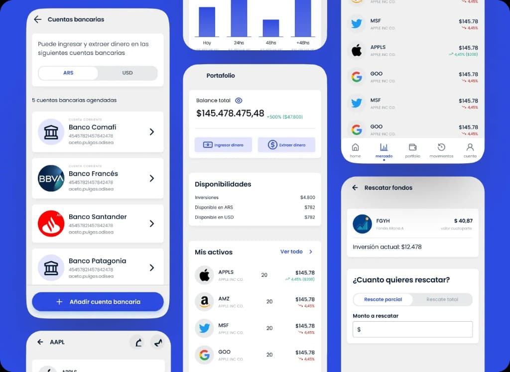
Designing clarity for portfolio, positions, movements, and financial operations
White-label trading and portfolio platform for stockbrokers. Dense screens where clarity and operations had to coexist.