

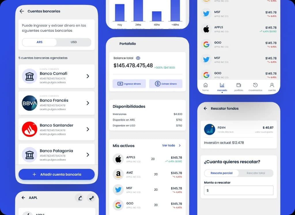
Fintech
Designing clarity for portfolio, positions, movements, and financial operations
White-label trading and portfolio platform for stockbrokers. Dense screens where clarity and operations had to coexist.
Wombi connects brands with UGC creators. I shaped campaign, application, evaluation, and selection until intent became collaboration.
01Context
Wombi is a UGC marketplace in Argentina.
Brands need videos for social, ads, or Mercado Libre. Creators produce them.
The problem was not showing a catalog.
A content need is not yet an opportunity a creator can evaluate.
Context is missing: what is expected, how compensation works, which conditions apply.
That context is not symmetric: brands and creators need different information.
Designing the flow meant deciding what appears, for whom, and when.
02The two-sided challenge
Each side enters the product with a different question. The system had to answer both without penalizing either.
The brand
Wants results and control without becoming a brief expert.
The creator
Protects their time: they do not want to apply blindly.
Designing a marketplace was not about connecting supply and demand. It was about designing enough context for both sides to decide without asking too much of either.
03User journey
I rebuilt the journey as a collaboration acquisition funnel. Each stage has an actor who decides and a specific way to fail.
| Stage | Actor | Decision | Risk |
|---|---|---|---|
01Create campaign | Brand | Define the need clearly | Ambiguous campaign → irrelevant applications |
02Publish | System | Validate and moderate before opening | Off-policy content slips through late |
03Discover and evaluate | Creator | Assess fit before investing time | Applying without understanding conditions |
04Apply | Creator | Propose price, timeline, and pitch | Weak application → does not help decide |
05Evaluate and select | Brand | Choose one profile among many | Not enough context to compare |
06Start collaboration | Brand + Creator | Confirm and move to production | Confusing transition between stages |
04Turning a need into a campaign
Campaign creation is a seven-step wizard.
General info, product, preferences, deliverables, compensation, questions, and summary.
Progressive and grouped by decision, not by form.
Every extra field improves context for the creator, but pushes the brand closer to drop-off.
The answer was not fewer fields, but hierarchy: required what changes matching, optional what refines it.
Compensation
Define how you will compensate the creator for each campaign video
Paid
The creator receives a money payment for their work
Barter
The creator receives your product or service as payment
Paid and barter
The creator receives a money payment and your product or service
The creator will see up to $103,200 as payment per video.
Decisión de diseño
Progress by decision, not by form
Seven steps with a stepper always visible. Each step groups one decision (what I promote, how I compensate, who I prefer) instead of a flat list of inputs.
Decisión de diseño
Required only where it moves the needle
Name, summary, platform, objective, mobility, deliverables, and compensation are required: they bring the right creator. Category, preferences, and questions stay optional.
Decisión de diseño
Conditionals to avoid showing too much
Product shipping only appears if the product is physical. Price fields only if there is monetary compensation. Each branch shows when (and only when) it applies.
05Designing the brief
In Wombi the brief is not a single text field.
It is built in the wizard and read as a structured piece in the campaign detail.
I offered two levels: creative freedom or a detailed script.
Brands without experience are not blocked; those with criteria can be precise.
Decisión de diseño
Two specification levels instead of a free field
Creative freedom vs. detailed script. It is an explicit brand decision about how much control to give up, and it gives the creator a clear expectation before applying.
Questions that guided the design
On AI · There is no AI assistance to write the brief. Guided fields, examples, and placeholders provide scaffolding: less fear of the blank page, without delegating the brand intent.
06Making conditions visible
Economic and participation conditions are what decide whether a creator applies. The design answers those questions before the CTA, not after.
Compensation modes
Paid
Money payment for each video.
Barter
Product or service as payment.
Paid + barter
Money and product combined.
Not every condition exists at once in each campaign: they appear based on compensation type, product, and preferences the brand defined.
07Discovering and evaluating a campaign
Campaigns
Video reviews of our new skincare line
Unboxing of our specialty coffee box
The listing uses lean cards: videos, category, compensation, title, and price range.
Just enough to decide whether opening the detail is worth it.
Brand and platforms do not appear on the card.
Hypothesis: prioritize opportunity and compensation over “who”, to evaluate fit by the work.
Decisión de diseño
Lean cards, fast decision
Design hypothesis: by not showing the brand on the card, the creator evaluates the opportunity by the work and compensation. It remains a candidate to validate with listing→detail conversion data.
08Designing the application
The application asks only for contextual data: price, timeline, revisions, message, and answers to the brand.
Age, location, and portfolio come from the profile.
Portfolio is not chosen per campaign: it reduces friction, at the cost of losing curation per opportunity.
A conscious trade-off in favor of application rate.
Inherited from profile
Asked per campaign
Decisión de diseño
Reuse the profile, ask only what is contextual
The creator does not rebuild who they are for every campaign. The application focuses on what changes between one opportunity and another (price, timeline, fit) and the rest is inherited from the profile.
Actionable compensation · “Your earnings” appears when quoting: if they deliver in 4 days or less, they receive 100% and save the 15% commission. Compensation becomes actionable, not an abstract number.
09From many applications to one decision
Applications arrive in the campaign “Requests” tab.
The list prioritizes what is comparable: portfolio, name, rating, location, and total price with taxes.
“What you see is what you pay” aligns comparison.
Evaluation happens in a drawer, not on another screen.
The brand reviews, decides, and moves to the next without losing the list.
Paula P.
CABA · ★ 4.8 (23)
Message
Portfolio
When you approve, you proceed to payment. Once done, chat with the creator is activated. Funds stay protected until you approve the content.
Aprendizaje
An honest gap: comparison and filters
There is no side-by-side comparison view. “Most relevant” is an unexplained score. Some filters appear in the UI but do not filter. Real product debt, documented.
10Hierarchy for evaluating creators
I ordered drawer information by how an application is actually read: from a quick filter to a decision.
Can this profile fit?
Identity, location, rating: the first-seconds filter.
What quality and style do they have?
Portfolio in vertical format, as content is consumed.
What do they propose?
Message, timeline, revisions, and price: the concrete offer.
Do I move forward or not?
Total to pay and what happens next. The action.
11States and expectations
Designing states meant designing the wait: what the creator sees between applying and getting a response, and what the brand sees while work progresses.
I do not claim this “reduces anxiety”: I have no quantitative evidence. It does aim for state and next step to always be legible.
The creator cannot apply again; they can edit or delete.
The collaboration is in progress. They are notified inside and outside the app.
Terminal state, communicated without ambiguity.
12The selection moment
The button says “Approve”, but the real commitment happens at checkout.
There the brand confirms payment, the collaboration is created, and chat opens.
Separating approve from payment avoids accidental acceptances.
Copy supports trust: “funds stay protected until you approve the content”.
Decisión de diseño
Separate “approve” from payment
Approval opens checkout; payment completes it. Two steps, one clear commitment moment, with escrow explained before paying.
Your content starts with this payment
When you pay, chat with the creator is enabled to coordinate content production.
13From application to collaboration
With selection, the product changes mode: from comparing candidates to coordinating work with one person.
Before · open campaign
After · collaboration
Collaboration reframes everything: Messages, Deliverables, Brief, and timeline by state.
If there is product shipping, it adds address and dispatch steps.
Actions shift from accept/reject to coordinate, deliver, and approve.
14Real constraints
I chose four constraints confirmed in the product that forced concrete design decisions.
What could happen
Without address and dispatch, the collaboration cannot start in “content in progress”.
Decision
Prior states (address, shipping, product in transit), guide banner, and fallback if the creator does not confirm receipt.
What could happen
Without money payment, “price per video” does not apply and the proposal becomes confusing.
Decision
Dedicated mode: price is hidden, product value and commission are requested separately. “Barter only” without ambiguity.
What could happen
Sharing contact takes the relationship off the marketplace and loses payment protection.
Decision
Block in application and chat with clear copy, plus a preventive banner before writing.
What could happen
If the brand lowers the cap, applications that exceed it remain.
Decision
They stay visible with an “Above max” badge. On accept, the creator’s original price is charged.
15Designing with moderation and trust
Contact moderation is part of the experience, not a technical detail.
It is anticipated with banners, explained when blocked, and escalates after repeated attempts.
Trust is also designed with language.
At checkout, escrow and direct communication appear right before paying.
Real moderation rules
16Product evolution
I do not have exact dates for each change. I do show how the flow grew as the marketplace added cases.
Campaign → application → acceptance → simple collaboration.
Barter and mixed appear: one economic model per modality.
Shipping adds address, dispatch, and receipt states.
Profile filters with reach estimate for the brand.
Contact rules and campaigns that enter review.
Source to reconstruct evolution: components, states, and flows present in the product today. Not a dated timeline.
17Impact
Scale numbers reflect the marketplace today. Impact metrics are internal estimates from the flow redesign, pending validation with analytics.
Platform scale
1,500+
Creators
Marketplace scale · review periodically
600+
Brands
Marketplace scale · review periodically
500+
Campaigns
Marketplace scale · review periodically
455
Screens designed
Frames audited in Figma (docs/screens)
Design impact · to confirm
~14%
Listing → application conversion
Internal estimate · review
~9
Applications per campaign (median)
Internal estimate · review
~22%
Selection rate (application → collaboration)
Internal estimate · review
-18%
Drop-off in campaign creation
vs. previous wizard · internal estimate
Scale metrics are reviewable periodically. Design impact metrics are internal estimates until confirmed with analytics sources.
Fintech
White-label trading and portfolio platform for stockbrokers. Dense screens where clarity and operations had to coexist.

Mass-market products • Own projects
Scattered local data slowed lodge discovery. I structured filters, trust, and content so the product could scale through organic search too.