

Product Design · UX/UI · Design System · B2B SaaS
A control panel so a real estate agency can stop running on spreadsheets and chats.
I designed Full Broker as a B2B back office to centralize properties, clients, and sales follow-up, with dense tables, clear statuses, and a hierarchy built for agents who need speed.
- Product
- Full Broker
- Role
- UX/UI Designer · Information architecture · UI Kit
- Duration
- 3 months
- Team
- 1 designer · 1 developer
- Tools
- Figma · Jira · Slack

Context
When real estate operations live in spreadsheets, everything takes longer than it should.
Full Broker was created to centralize properties, clients, and sales follow-up in a B2B panel. The challenge was not just ‘building a dashboard’: it was organizing dense information for daily use.
Real estate agencies often run on manual processes and disconnected tools. Each agent organizes properties, leads, and tasks their own way, which leads to duplication, lost leads, and little visibility into the sales pipeline.
The proposal was a single control panel with clear modules: operational summary, property management, client CRM, and calendar.
I was not designing a marketing website. I was designing the tool where the agent spends most of their day.
Manual processes
Daily operations depended on spreadsheets, messages, and disconnected tools with no single source of truth.
Fragmented information
Properties, leads, and sales statuses lived in different places, making it hard to prioritize and follow up.
Low operational visibility
Without a shared dashboard, it was difficult to see what was active, what needed action, and which leads were at risk.
User
Matías needs order, not more Excel columns.
Real estate agent
Matías· 35 years old
- Goal
- Manage properties and clients with order, without losing leads or duplicating tasks.
- Frustration
- Messy Excel spreadsheets, manual follow-up, and little clarity on the status of each opportunity.
Architecture
A modular structure to operate without losing context.
I defined the main navigation and the relationship between modules before designing screens. The dark sidebar holds the structure; the content breathes in the main area.
Dashboard
Operational summary and key metrics.
Properties
Listing, creation, editing, and statuses.
Clients
Lead CRM and follow-up.
Calendar
Visits, calls, and tasks.
Settings
Preferences and administration.
UI Kit
B2B visual system: trustworthy, dense, and readable.
Modern sans-serif with clear hierarchy between metrics, module titles, and tabular data.
Primary blue
#3B5BDB · Actions, active navigation
Violet
#7C5CFC · Accents and brand gradients
Lavender
#EDE9FE · Soft backgrounds and sections
Dark sidebar
#1A1D2E · Main navigation
Key screens
Interface design to manage properties and clients at scale.
Main dashboard
Summary cards with active properties, new leads, and recent activity to orient the day.
Property table
List with filters, search, and status badges (available, reserved, sold).
Property detail
Form for photos, location, price, and features with clear hierarchy.
Client management
CRM view for leads, contact history, and next steps.
Responsive
Operations also happen outside the office.
I adapted the main views for mobile, keeping hierarchy, statuses, and critical actions accessible for agents on the move.
Learnings
Principles that stayed from the project.
The table is the product
In a B2B back office, list readability, filters, and statuses matter more than decorative screens.
Visible statuses, less friction
Badges and semantic colors help scan operations without opening every record.
Design for daily use
The panel is used every day: I prioritized consistency, visual shortcuts, and controlled density.
Más proyectos

B2B • Marketplaces • SaaS / management tools
Designing the flow that turns campaigns and applications into collaborations
Campaign live, applications in, creator still to pick. I bridged brand and creator without losing context until collaboration starts.
Fintech
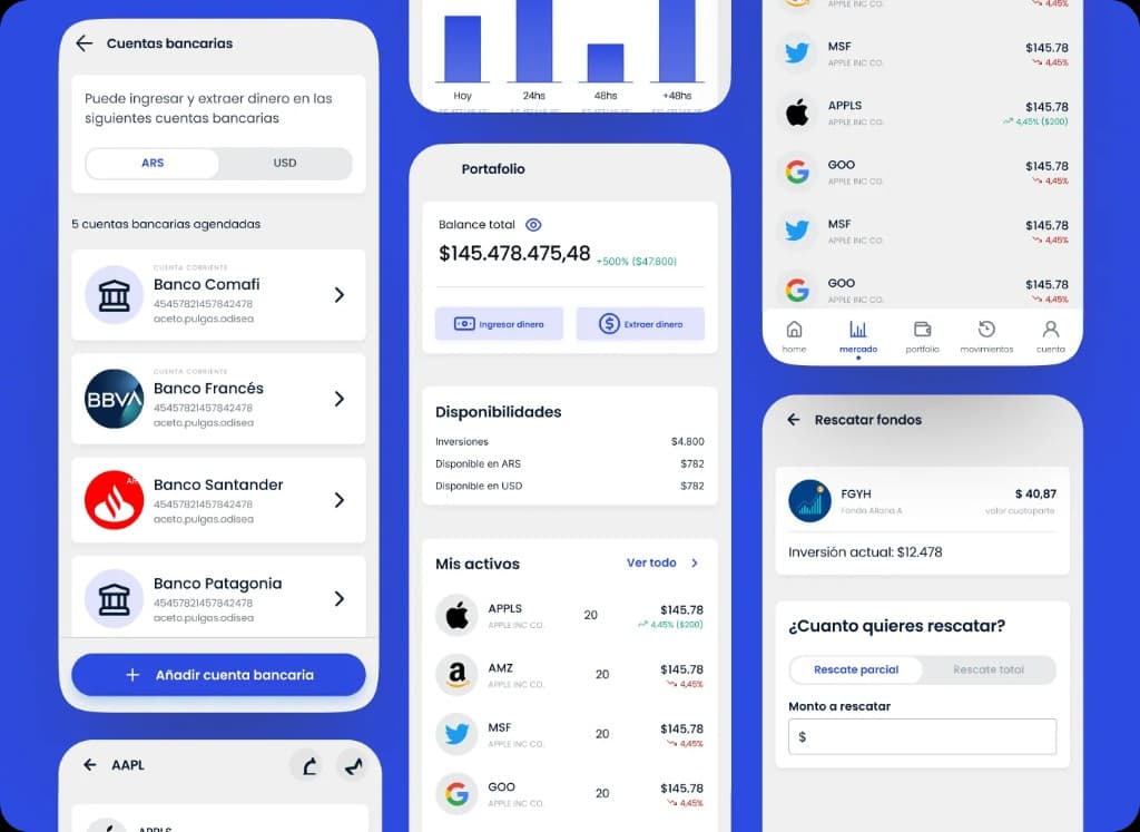
Designing clarity for portfolio, positions, movements, and financial operations
White-label trading and portfolio platform for stockbrokers. Dense screens where clarity and operations had to coexist.