

Product Design · B2B · Supply Chain
Turning a multi-month international order into something a buyer can actually follow
Redesigning Marteu's Order Page so B2B buyers can understand progress, pending actions, and logistics without relying on support.
Marteu connects U.S. buyers with manufacturers in India for international tile purchases. A single order can span weeks or months, multiple payments, production milestones, QA/QC, and several containers on different timelines.
- Product
- Marteu
- Role
- Product Designer
- Users
- Buyers (U.S.)
- Scope
- Order Management Experience
- Timeline
- 2023 - 2026 · Order Page redesign · Nov 2025
- Team
- Product, Engineering, Operations stakeholders
Industry
B2B Marketplace / Supply Chain
B2B platform connecting U.S. buyers with manufacturers in India for international tile purchases across quotation, production, QA/QC, and logistics.
Conceptual previews will be replaced with final product screenshots.
Overview
A B2B order page for operations that take weeks, not minutes.
Before screens, the work was understanding what buyers need to trust a purchase that crosses countries, teams, and months.
Marteu is a B2B platform that helps U.S. buyers manage international purchases of materials, especially tiles, with manufacturers in India. The product sits at the intersection of commerce, production, quality control, and logistics.
The primary user for this work is the buyer: someone responsible for confirming an order, funding it, tracking production and shipping, and receiving goods in the U.S. They need confidence over a long horizon, often without deep operational knowledge of freight, QC, or fund release.
The Order Page is the buyer's primary source of truth during the lifecycle of a purchase. It must answer orientation questions quickly, reduce uncertainty during long waits, surface required actions, and allow deeper inspection when needed.
Order #MRT-2847
Ceramic tiles · 3 containers
Updated Mar 12 · $48,200 total
Action required
Review delivery address before trucking begins
Confirmed
Production
Shipping
Delivery
Done
Current milestone
In transit · CNT-01 departed origin port
Conceptual Order Page preview
The challenge
Condense a long operation without losing truth or clarity.
The page had to condense operational reality into one experience without falling into two failure modes: overwhelming detail or oversimplified status labels.
The page had to answer
- Where is my order?
- What happened recently?
- What comes next?
- Do I need to act?
- How much have I paid and what is pending?
- What products are included?
- What is happening in production?
- How is shipping progressing?
- Are there multiple containers?
- When might goods arrive?
- What documents support each stage?
Too much detail
Showing every internal substate and document at once mirrors backend complexity and overwhelms users who mainly need orientation.
Too much simplification
Collapsing everything into a label like "In Production" hides what happened, what comes next, and whether action is required.
Order lifecycle
Map the system before designing the interface.
Macro stages give orientation. Sub-states give context. Both were needed.
Full operational journey
Buyer-visible macro stages
Stage 1
Order Confirmed
Stage 2
In Production
Stage 3
Shipping
Stage 4
Delivery
Stage 5
Completed
Macro stages (orientation)
- Order Confirmed
- In Production
- Shipping
- Delivery
- Completed
Operational sub-states (context)
- Pending acceptance
- Accepted
- Pending funds
- Paid
- Packaged
- QC
- Shipment booked
- In transit
- Destination port
- Trucking
- Delivered
Example under Shipping
Key UX problems
Five friction points that shaped the redesign.
Status without context
A label like "In Production" does not tell the buyer what changed, what comes next, whether they must act, or whether a delay is normal.
Status is not information. Context is.
Information fragmentation
Products, payments, production, QA/QC, and logistics belonged to different parts of the operation, but the buyer experiences one order.
The page needed one coherent order narrative, not a mirror of internal systems.
Action ambiguity
Buyers needed to distinguish passive information, progress they can monitor, and actions they must take now.
Required actions need a different hierarchy than status updates.
One order, multiple shipments
A single order could include CNT-01, CNT-02, and CNT-03 advancing at different speeds. One linear bar misrepresents reality.
Tracking had to work at both order and container level.
Long periods of uncertainty
International operations can take weeks or months. Small state changes matter a lot during those periods.
The experience had to reduce uncertainty continuously, not only at major milestones.
Design principles
Rules that kept complexity manageable.
Show progress before detail
Lead with where the order is in its lifecycle before exposing operational depth.
Make required actions impossible to miss
Payment, confirmation, and inspection tasks should not compete visually with passive updates.
Reveal complexity progressively
Buyers understand state, next step, and progress first. Payments, containers, and docs can come later.
Separate commercial, operational, and logistics information
Money, order contents, production, and shipping were grouped by buyer intent, not backend structure.
Design for exceptions, not only the happy path
Delays, partial shipments, pending funds, and inspection periods are normal in this domain.
Information architecture
Structure the page around buyer questions, not backend modules.
Not every block is visible at all times. Progressive disclosure controls depth.
01
Order overview
ID, stage, dates, value
02
Current status
Macro stage + sub-state
03
Required action
Only when the buyer must act
04
Progress timeline
Past, current, upcoming
05
Order details
Commercial & admin
06
Products
Items in the order
07
Payments
Paid vs. pending
08
Production
Manufacturing context
09
Shipping / containers
CNT-level when needed
10
Delivery
Trucking, arrival, inspection
11
Documentation
Files by stage
Redesigned experience
From orientation to detail, in layers.
The Order Page works as an inbox, a progress tracker, and a record viewer.
Immediate order overview
The top of the page answers the first questions in one scan: order ID, current macro stage, relevant dates, order value, and the most important summary. Optimized for return visits when buyers already know the order exists.
Order #MRT-2847
Ceramic tiles · 3 containers
Updated Mar 12 · $48,200 total
Action required
Review delivery address before trucking begins
Confirmed
Production
Shipping
Delivery
Done
Current milestone
In transit · CNT-01 departed origin port
Conceptual Order Page preview
A progress model buyers can understand
Five macro stages provide a stable mental model. Sub-states add operational context without forcing buyers to learn internal terminology upfront. Macro stage is the chapter; sub-state is the current scene; timeline is history and what comes next.
Order #MRT-2847
Ceramic tiles · 3 containers
Updated Mar 12 · $48,200 total
Action required
Review delivery address before trucking begins
Confirmed
Production
Shipping
Delivery
Done
Current milestone
In transit · CNT-01 departed origin port
Conceptual Order Page preview
Actions separated from passive information
Required actions such as completing payment, confirming information, or inspecting delivered goods were treated as a distinct mode. Passive updates like "Packaged" or "In transit" should not look the same as "Payment required."
Interaction detail (conceptual preview) for Actions separated from passive information
Designing for multiple containers
When an order included CNT-01, CNT-02, and CNT-03, each container needed its own status, milestone, dates, and tracking context. Order-level summary plus container-level detail avoided false simplicity.
Order-level summary
Order #MRT-2847 · Shipping
3 containers · Mixed milestones
CNT-01
In transit
Pacific Ocean
CNT-02
Shipment booked
Awaiting departure
CNT-03
Packaged
Production complete
Progressive disclosure
The default view prioritizes current state, next step, and overall progress. Deeper layers expose payment breakdown, products, container details, documents, and event history.
Interaction detail (conceptual preview) for Progressive disclosure
Key design decisions
Problem, decision, and rationale.
Problem
Internal states were too granular for primary navigation.
Decision
Group operational states under five macro stages.
Why
Buyers need chapter-level orientation before operational precision.
Problem
Macro stages alone were too broad during long phases.
Decision
Keep sub-states visible as secondary context tied to the current stage.
Why
Context reduces anxiety without teaching the full backend model upfront.
Problem
Buyers needed history and forward visibility, not just a label.
Decision
Use a timeline combining recent events, current milestone, and upcoming steps.
Why
In long B2B processes, timeline is a trust mechanism.
Problem
Important tasks were easy to miss among passive updates.
Decision
Separate required actions into a dedicated, high-priority surface.
Why
Action clarity is part of product reliability in operational products.
Problem
One progress model could not represent split shipments.
Decision
Support order-level summary plus container-level tracking.
Why
Accuracy matters more than visual simplicity when shipments diverge.
Problem
Commercial, operational, and logistics data lived in different systems.
Decision
Group information by buyer intent: overview, products, payments, production, shipping, delivery, docs.
Why
It matches how buyers ask questions and reduces cognitive reconstruction.
Iterations and trade-offs
Exploration and product discussions, not validated user testing.
During exploration, several tensions shaped the direction.
Tension
Full timeline vs. simplified timeline
Tension
All sub-states vs. current sub-state only
Tension
Single page vs. expandable sections
Tension
Order-level vs. container-level tracking
Tension
Operational language vs. buyer-friendly language
Wireframe iterations (conceptual preview)
Más proyectos

B2B • Marketplaces • SaaS / management tools
Designing the flow that turns campaigns and applications into collaborations
Campaign live, applications in, creator still to pick. I bridged brand and creator without losing context until collaboration starts.
Fintech
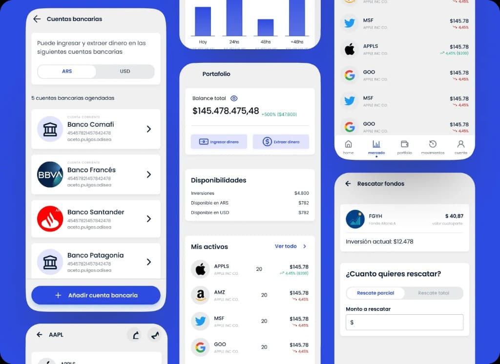
Designing clarity for portfolio, positions, movements, and financial operations
White-label trading and portfolio platform for stockbrokers. Dense screens where clarity and operations had to coexist.