

Product Design · UX/UI · Fintech · Mobile
Invest in the stock market from your phone, without the interface getting in the way.
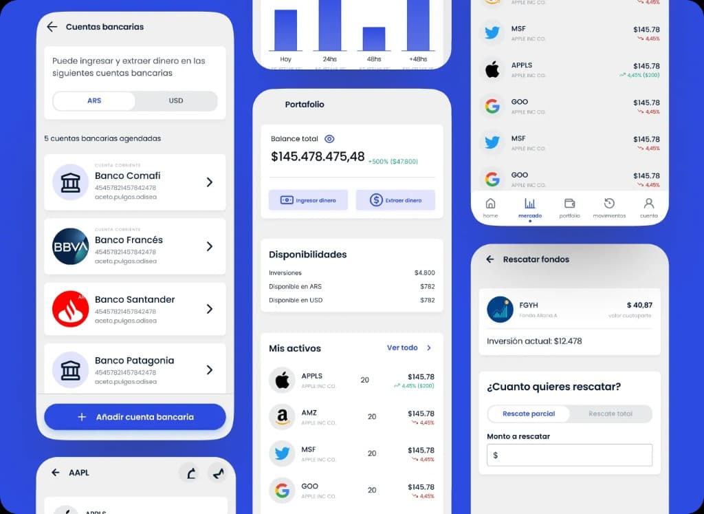
I designed Home Broker to democratize access to capital markets: a mobile experience with a clear dashboard, browsable market, asset detail, and guided buy and sell flows.
- Product
- Home Broker
- Role
- UX/UI Designer · User flows · UI Kit · Prototyping
- Focus
- Mobile-first design
- Tools
- Figma

The project
Invest in capital markets from your phone, with an experience built for retail users.
Home Broker aims to democratize access to the stock market with a simple, secure mobile app: view your portfolio, explore the market, and trade without feeling like the tool is working against you.
The project starts from a clear premise: investing simply and securely should not require learning a hostile interface first.
I designed a mobile-first experience with onboarding, biometric login, portfolio dashboard, asset exploration, and buy and sell flows with explicit confirmation.
The design had to reduce the anxiety of moving real money, not add drama with more data on screen.
Problem and solution
Less visual complexity, more clarity to decide and trade.
The problem
Intimidating platforms
Existing apps often feel complex for users who are just starting to invest.
Unclear language
Financial terms, data density, and weak hierarchy make it hard to know what to do at each moment.
Friction in trading
Buying or selling takes too many steps, with little guidance and insufficient feedback along the way.
The solution
Clean interface
Clear visual hierarchy for balance, performance, and holdings without cluttering the screen.
Guided processes
Step-by-step flows to trade with confirmation and explicit success states.
Accessible language
Copy and structure designed to reduce the learning curve for retail users.
Personas
From first-time investors to people who trade every day.
Novice investor
Lucas
- Goal
- Start investing with confidence, understanding what he buys and how much he risks.
- Frustration
- Platforms feel technical to him and he fears making mistakes when trading.
Experienced trader
Carla
- Goal
- Check prices, charts, and execute trades quickly from her phone.
- Frustration
- Slow apps or too many steps for actions she repeats every day.
User flow
A complete path from login to trade confirmation.
I mapped the critical journey so each step has a single focus: sign in, understand the market, analyze an asset, trade, and confirm with clear feedback.
Design system
A fintech visual language: trust blue, green and red with purpose.
Modern sans-serif with contrasting weights for balances, tickers, and market data.
Primary blue
#2563EB · Header, primary actions, brand
Green
#16A34A · Gains, buy, success
Red
#DC2626 · Losses, sell, alerts
UI gray
#F3F4F6 · Backgrounds and secondary cards
Key screens
Portfolio, market, detail, and trading in high fidelity.
Dashboard / portfolio
Total balance, daily performance, and asset list with green or red variation.
Market
Search and filters by instrument type: stocks, bonds, CEDEARs.
Asset detail
Chart, key stats, and fixed buy and sell actions.
Trading
Amount or quantity form, total estimate, and trade confirmation.
Success
Confirmation screen with transaction summary and return to portfolio.
Learnings
What the project left as mobile fintech design criteria.
Trust is designed into the flow
In retail fintech, every purchase step needs clarity on amount, fees, and outcome.
Color with function, not decoration
Green and red communicate variation and trade type; they must be used with semantic consistency.
Mobile first, always scannable
Users trade on the go: I prioritized cards, readable lists, and fixed CTAs on critical screens.
Más proyectos

B2B • Marketplaces • SaaS / management tools
Designing the flow that turns campaigns and applications into collaborations
Campaign live, applications in, creator still to pick. I bridged brand and creator without losing context until collaboration starts.
Fintech
Designing clarity for portfolio, positions, movements, and financial operations
White-label trading and portfolio platform for stockbrokers. Dense screens where clarity and operations had to coexist.